Bedouin Connor
Early versions of KQ8 in screenshots had Connor dressed as Bedouin sort of adventurer, traveling through a much more lush and traditional Daventry.
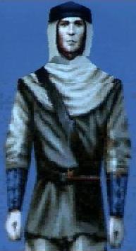

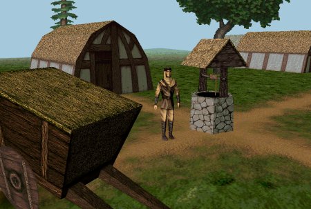
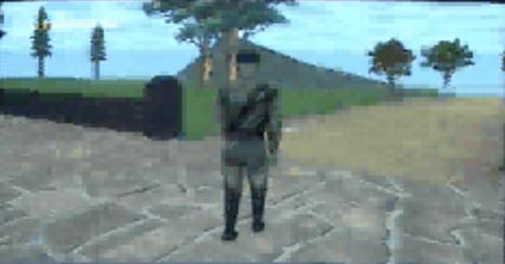
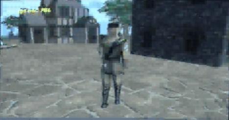
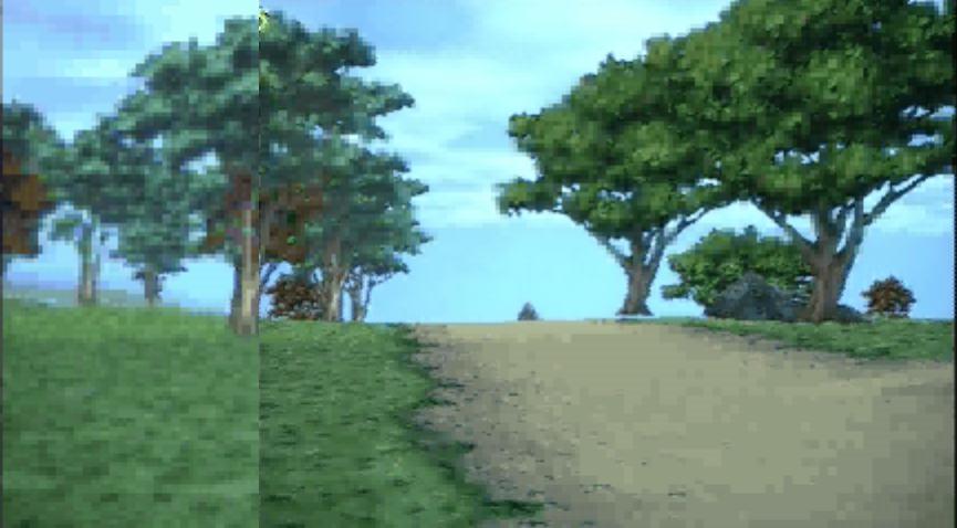
Compared to the Connor and Daventry we eventually got,


I wish this early version of KQ8 was released. It seems much more mythical than the KQ8 we finally got. The lost KQ8.
Even the cover art for the '96/97 version of KQ8 was better than what we finally got:


My big dream is to one day recreate KQ8 as shown in those early screenshots.


Compared to the Connor and Daventry we eventually got,


I wish this early version of KQ8 was released. It seems much more mythical than the KQ8 we finally got. The lost KQ8.
Even the cover art for the '96/97 version of KQ8 was better than what we finally got:


My big dream is to one day recreate KQ8 as shown in those early screenshots.
Sign in to comment in this discussion.

Comments
Actually it look closer to Templar knight, or medieval knight robe.
Or even traditional medieval peasant garb;
I also suggest look up midevial fisherman, for a very similar garb to what Connor is wearing (fitting that at that point Connor was a fisherman with the name 'mac Lyrr', sea god related name).
Connor looks like he is wearing peasant fisherman garb, with a the hood with mantle. He appears to be wearing a metal or it could be leather skullcap over the 'hood'. He has leather vambraces on his arms (definitely more European medieval). Even the strapped up boots resemble some of the medieval styles.
Ethnic Bedouin looks very different than what Connor was wearing (billowy robes, rather than a jerkin and pants, and no mantled hood.);
It's just a placeholder because even that early on Roberta and her team were discussing How Conner was going to be able to collect different armors and weapons throughout his journey that would change his appearance.
I don't recall her talking about him changing his armor until later iterations of the game--around '97, '98. If you notice, we went through several different versions of Connor, both in the conception of who he was as a character (first as a statue turned to life, then as a son of a fisherman, than as simply a peasant/tanner), to his appearance (consider Consider's looks in '96, '97, and finally in '98 in the released version of him).
The idea of him as a fisherman I think fits better than him being a tanner. It fits into that whole Christian element she was going for with the story--Consider that some of Christ's disciples were fishermen, and the Christian/Arthurian legends of the Fisher King, etc. His whole appearance in the Fisherman garb legends a great air of mystique and epicness to the game and makes him stand out as a character, whereas his final, released incarnation is kind of bland.
His outfit at the start of the game is almost like a rip-off of Graham's adventurer clothes, sans cap.
This fisherman version of Connor would've stood out more, would've been more unique, more mysterious. Even the statue turned to life idea had more potential than having him be a simple tanner, and would've been in line with the fairy tale nature of the series--That he's rewarded humanity at the end for his noble deeds, ala Pinocchio. That would've been a nicer ending than the one we got.
Actually there is at least one 1996 article or interview that discusses the idea. I'd have to find it again. I remember that at the time they only had the 1996 engine screenshots.
Not actually a ripoff it's standard medieval style tunic. Almost everyone wore that style back then (unless you were middle-class or nobility). At least under their jerkins.
Notice the fisherman artwork above appears to have red medieval style tunic under the guy's hood and mantle.
Actually even tanner has very biblical and highly Christian symbolism. Look up Simon the Tanner! He represented the gentile Christians! Peter lodged with him three times using his house to spread the gospel to the Gentiles. He represented a break from Jewish Levitical law, which forbade touching dead things. Jewish people had aversion to tanners because it represented ceremonial contamination. Note that Gentiles were also seen as contaminating to Jewish society as well, since they didn't follow the same beliefs. So for Peter a Jew to stay there, he was showing that the gospel was for everyone and that he was willing to set aside older traditions to spread the word.
Basically the job of 'tanner' was one of the lowest positions in society, looked down upon by other members of the society. Yet, someone that far down the totem pole could be accepted by Christ to become a member of his new 'Kingdom of Heaven'. Infact a valued member of that new kingdom, perhaps more valued than any earthly king ('the meek shall inherit the earth').
Note that Conner not only deals with death, he deals out death! He starts out as a lowly tanner, from perhaps one of the least respected career choices. He slowly grows into a knight, essentially of paladin of ideals. Becomes noble not by birth, but by virtues. He becomes a valued member of Daventry. He reaches 'Heaven', basically.
One could argue that the role of 'tanner' has far more signifigance in many ways than than 'fisherman' would have for Connor in Christian symbolism. Bibically the symbolic role of 'fisherman' in the bible was that of 'fishers of men'. To haul in and teach new converts. Connor does not share this role at all in the story... He is not trying to convert anyone, he is not a teacher... He basically is out to destroy all evil.
I wish we had gotten to see the lusher Daventry and the sea-side level. It looks like the town shown on the final gameworld map was to be included (see the shots of Connor entering a town like area). It might even have fit with the town in the novels! This is why I want to recreate the game. So far we know of at least 3 whole levels cut--the sea-side town/Daventry town, the entire interior of Castle Daventry, and the underwater level.
Yes, I've seen the screenshot of the graveyard in Daventry from the spring '97 InterAction issue. It's the same style graphics as the Fall '96 issue. The graveyard looks a lot different and a lot creepier.
I really want to someday rebuild this game or remake it, like shown in the screenshots. Those trees in the lush Daventry may be 2D, but, lower polygons or not, it has a much more quaint look than the late '90s, blocky look of the final game.
Can you recommend some games from the mid '90s (1993-1997) which have graphics similar to the '96-97 version of Mask?
Another level that was cut, was the floating outside levels for Realm of the Sun. There is at least one screenshot for it.
In earlier version of the game, the Realm of the Sun was to be an island in the sea. Which would have been very different.
There was also supposed to be a dark Abyss level too (but this might have been an early version of Dimension of Death/Ream of the Dead).
Paradise Lost was going to be itself a realm of darkness.
"quaint" is not really a positive term... I think they look bad... The industry would have been highly critical had those graphics came out in 1998... They were very critical of Tomb Raider 3's graphics for example which came out one month before Mask, and hadn't upgraded the engine at all. Tomb Raider 3 actually got worse ratings as far as graphics compared to MOE. Tomb Raider 3 suffered because of it...
MOE wasn't the best looking, but it looked better than most Third-Person games at the time. It also has somewhat of a hand-drawn cartoon sensibility about it (in colors and facial animation/emotions). More Black Cauldron than say Cinderella (KQ7).
There is a reason why Roberta has been said to not be happy with the how MOE looked. It's one of her biggest criticisms of the game. She was hoping to have something that looked superior to anything out there, and she was barely better than Tomb Raider 3 (which still had some 2D sprite elements)...
Hell, it's harder for me to play games from that era, because how cringe-worthy bad they look... It really takes me out of the game... There is very little 'nostalgia' that could save it for me. KQ8 in its finalized form still looks primitive, but its not the worst from that era.
One game that I have a hard time playing now because of poor polygon look is Jedi Knight, now that game looks super blocky by today's standards...
Star Wars: Obi Wan used the same engine from Jedi Knight, on the Xbox and it looks absolutly horrid.
The only one to use the JK engine that aged well enough (for me to play) is probably Indiana Jones and the Infernal Machine, but it still looks pretty horrid by today's standards.
Even Quake looks pretty bad by today's standards, and is hard for me to play...
I can handle Thief 1 and Thief 2, since it has reasonably good textures, excellent atmosphere, and can be boosted into higher resolution wide-screen modes, which helps the clarity and sharpness somewhat. Some people have come out with higher resolution texture patches too (mainly converting Thief 2 graphics back into Thief I).
If Roberta's KQ8 had come out in 1996 (with its 1995 graphics) it might have done quite well. But by 1998 people demanded much more. The public and audience demanded much more. Remember people just weren't buy adveture games. Partly that has to do with the demand for improved graphics. Sure its a shallow reason not to try a game, but it was still an fact that designers had to live with
There is also a Prince of Persia game from that era, but it looks pretty bad and clunky as well. I don't think it did well.
Yes, I know they didn't cut it fully. I just would've loved a full exploration of the Castle, with a "stoned" Rosella and possibly Valanice and just for once finally seeing the humble abode of the Royal Family. It'd have strengthened ties that much more with the original series.
By the way, I just got the Second Edition of the KQC and I found it interesting how Castle Daventry is "rumored" to have secret passageways and possibly even magical places which could teleport people to other lands--The Second Edition came out in 1990, and this idea of Castle Daventry having secret passages and entrances was incorporated into KQ8, as was the idea of it having teleportation areas (used in the Olde Castle Keep).
Could you find the screenshot or a description of this cut area, please? Never heard of it before.
Where did you hear this? I'm always impressed by your knowledge of the game's development history.
It's possible...Perhaps they were two separate locations which were combined into one to save time/money.
It could've worked as a corrupted realm, a sign of what the entire world would become if Lucreto won. Which would make the mission even more urgent. That the entire world would plunged into barren darkness, a void of darkness...Almost Dore-esque, maybe.
I suppose....I just think they have a better look to them than the blocker games of the late 1990s. It's all a matter of taste though. I do not like late 1990s 3D games; They are too blocky. But some of the early 3D games, like Anvil of Dawn or BaK have a really nice look to them IMO.
Mask should've come out in 1996 given that Sierra had established a two year release pattern for KQ games (KQ4 in 1988, KQ5 in 1990, KQ6 in 1992, KQ7 in 1994). If it had come out in 1996 with the graphics shown in InterAction, it'd have been revolutionary, moreso than any Tomb Raider or Quake.
It's mentioned on a fragment of notes by Roberta Willliams and in the 1996 issue of Interaction;
Will it bear such hallmarks as the Kingdom of Daventry?... Connor begins his adventure in the Kingdom of Daventry, but he doesn't stay there long. Seven new lands await!... The world of King's Quest: The Mask of Eternity reaches from the sunless Underworld of the living dead through the alchemical plains of Earth, Air, Water, and Fire, into the ether of the Celestial Realm--and even to a dark mysterious island temple...
-Interaction magazine, Fall 1996.
Both Anvil of Dawn and Betrayal of Krondor are 2D sprite based games with 3D maps.
They have more in common with the graphical style of Doom.
Actually I find myself able to play Doom, without it feeling as 'aged'. Mainly because the sprites are handpainted 2D. They don't have the 'blockiness' of early 3D model based games. So they are actual artwork.
Having a mix of 2D and 3D objects isn't so nice though. Tomb Raider can look very dated with its mix of 3D enemies, and 2D sprite based background elements.
One of the improvements in Mask was the the fact that all trees, plants etc, in the game are 3D. She did away with 2D sprites. So it has visual consistency.
If she ahd made the game in 1993 for example as 2D on 3D map, it might have still stood on its own, since the style would have been consistent.
What games (between '93-96) would you say are graphically very similar to the '96-early '97 version of Mask? I want to get a feel for how a game that's 3D with 2D elements (like 2D trees) would be like, so as to help in my remake.
Obviously a handful of mech and flight sims.
Ultimata XI: Accension came out in 1998 or 1999, and roughly resembles hack and slash elements of KQ8 with the full 3D world.
Most other games at the time were 2D sprites on 3D, a very different art style.
If you want 3D characters with some 2D sprite based stuff, see any early Tomb Raider game, or anything using the JK engines. Quake may have some sprites for use of 'fire'.
I'm pretty sure Thief series is all 3D.
Obviously Super Mario 64 is both 3D characters, and sprite based. King Bobomb for example was made up of a sprite with 3D elements attached. The trees were sprites.
Zelda 64 is largely all 3D with only a few flat sprites for distance backgrounds.
Actually some modern games use 2D sprites for distance artwork, that turn into 3D as you move closer to them. For example Lord of the Rings Online uses that effect. This gives background an overgrown look. Since trees on the mountains in the distance are 2D objects. But you can't tell from a disstance. But if you move up to those trees, they replace them on the fly with a 3D tree. So it gains depth and realism on closups.
JK engine?
Hmm. There has to be something else out there from the mid 90s (pre 1998) closer in style to the early Mask than any of those other games. What about the RPG games of the mid-90s (non-Diablo)?
RPG games of that era were mostly 2D or 3D worlds with 2D sprites For enemies and NPCs like in Doom or Duke Nukem, just turn based. See Might and Magic series for example. Many remained overhead 2D like Balder's Gate/Diablo II.
They weren't 'full-3D' games, and most were 2-d.
http://en.wikipedia.org/wiki/List_of_role-playing_video_games:_1994_to_1995
http://en.wikipedia.org/wiki/List_of_role-playing_video_games:_1996_to_1997
A few other RPGs such as 1997 Final Fantasy VII went with the 2D backgrounds, with 3D characters on top (similar to Grim Fandango).
Remember, Roberta was trying to make an original game, that was supposed to be innovative in many ways. There really isn't much out there at the time that has its look, interface, etc...
We know Roberta says she took inspiration from Doom, Duke Nukem, Quake, Tomb Raider, Mario 64 and later Zelda 64, and many of the Dynamix games as far 3D games are concerned. We also know she wanted more full-3D as opposed 2d character sprites on 3D world.
Actually it might be a discusssion that would fit well in the KQ8 Remake thread topic hmm?
As per GuruGuru's thread policy;