main25
main25
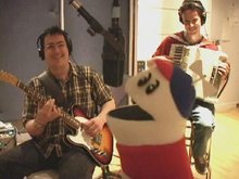
A new main page is up, and it is based around my favourite HSR spin-off, the puppets!

Am I the only one who doesn't like the new logo/buttons (I know they were on 24, but that was blurred most of the time)? I think the line going across them stands out too much. I know the effect that is trying to be pulled off, but I don't think it works very well here. Probably just me being petty again.
A new main page is up, and it is based around my favourite HSR spin-off, the puppets!

Am I the only one who doesn't like the new logo/buttons (I know they were on 24, but that was blurred most of the time)? I think the line going across them stands out too much. I know the effect that is trying to be pulled off, but I don't think it works very well here. Probably just me being petty again.
Sign in to comment in this discussion.
