Visual Style (ANF vs. 1&2)
Not sure if this discussion has been made already. Link me to one if there is.
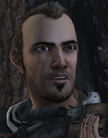
I want to see everyone's opinion on the visual style of Season 3 and if they prefer it over Seasons 1 & 2.
Personally, I though the style looked fine, but I long for the old look modeled off of Tony Moore's original comic style. It's probably mostly just nostalgia kicking in, but I added something so unique to the first two seasons. The new look, although decent, loses its charm and makes it fade into the pit of other generic video games. I'm fine with them using the new look in other telltale games, but Walking Dead should look like Walking Dead IMHO. I'd like to see how Telltale's new engine would work with the Tony Moore style. Anyone else agree?
Sign in to comment in this discussion.

Comments
The style is good but I still prefer S1&2 syle, it looked more familiar.
Besides, S3 style has you spend more time lagging than actually playing the game.
ANF looks way better graphic and animation wise, the engine swap was needed
Kenny looks like he's melting and Jane looks more like a man.
that's because their models were neglected for some reason the rest of the characters look fine
New Frontier had the best look by far. I still can see a little comic book resemblance from the backgrounds. Season 1 had the closest comic look. I think at one point they even talked about making the first game black and white just like the comic.
I liked the old looks but most of the characters more presumably Clem and Javi look the best in my opinion.
Finely disgusting.
Replaying season 1 i notice all the lovely details in the animation, the artistry. New Frontier looks lovely but there's something about the first season that is really beautiful.
The shades in ANF look like they've been shat all over.
I like how ANF looks. It's not as good as the previous seasons that's true. Especially 1. Infact fuck it, i agree, it doesn't hold a candle to the way season 1 looked.
I actually think the second season perfected on the already impressive style that season 1 had. It didn't try to change too much; just enhanced what was already there.
Season 2 had more style to it, ANF looks like telltale was trying to make everyone "realistic" looking.
I liked S1 & S2 visual style more. ANF's visual style makes me feel as if I'm not on East coast USA, but somewhere in Brazil.
Especially zombies:
It's probably clothing and skin color what makes me feel this way.
Season 2 would be my favourite.
Brb crying
ANF has some nice visuals, and the main characters look pretty nice. The only thing I dislike in ANF is the details (or lack thereof) of side characters and walkers. Have you ever noticed how good Javi, Clem and all the other main characters look, but how shitty all the side characters look? Especially the walkers, they look like they've been made in 3 minutes.


Just take a look at any side characters from Season 1 or 2 (the Russians, for example) and just compare them to Season 3 side characters (ANF members). You can actually tell they're people, not some humanoid aliens that can talk with their lips barely moving.
VS
The problem with the new style is apparently it's harder to make unique looking zombies and background characters also people are untextured and the gore is weak. I'd say the old style pops more visually.
Nah everyone looks so sweaty and wet all the time
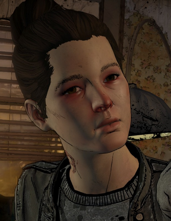
Yep. Love the graphics but that character in that first image? Why? Why the hell couldn't they give here any facial expressions in a scene where someone breaks her arm leaving this to be unintentionally funny?
I see the ANF art style something like a game trying to be photorealistic but with a comic shader slapped on it. Some scenes are weirdly lit too, when characters have a blue highlight when it's the middle of the day. The model quality is okay, but the hair models need some work.
Personally, I prefer the S2 art style, it looked amazing and clean.
She's not showing any emotion even though her daughter and husband are bloody dead. Is it that hard to animate a face just for like 30 seconds?
I won't deny that ANF had the better graphics when compared to S1 and S2, but if I'm being honest, the first two seasons did take more inspiration from how the comic looks, just in color, and it provided a very nice feel to the game. S1 did great with this, and S2 did even better, and that was the feel that Telltale wanted to go with when they were making this series. While it's not a huge problem and part of me does like the graphical improvement, I also can't deny that the change in visual style is something that bugs me about ANF as it, again, seems to distance itself from the previous installments.
Not everyone in Brazil is black and dresses as if they're on a party you know.
ANF looks a little more realistic while Seasons 1 and 2 looked more cartoony and comic book-like. Personally, I prefer the latter, but understand why they felt the need to change it.
I never implied that. Go get triggered somewhere else.
Elaborate then.
In fact yes, animate face is very more complicated than move a whole body
S2>S1>>>>>>>>>>>>>>>>>>>ANF
ANF or "welcome in the shiny greasy faces world"
What is there to elaborate? Not everyone in ANF is black? No one in ANF dresses as if they're on a party?
ANF has more warm colors and when it's suppose to be dark it's usually not that dark.
In case of Zombies in ANF, they wear mostly summer clothes and there's no pale zombies like there are in S1 & S2.
That gives a vibe of a place that has a warm climate, like Brazil.
Ah okay then, but I live in Brazil and the climate is very similar to the south of the US.
If they could do it for major characters the entire season, having Fern move her mouth in one scene shouldn't be hard.
The new look has grown on me. I still prefer the old look, more towards the Season 2 look. Season 2 to me had the living comic book style of Season 1 with better details, colors, and shading. The more life-like look of ANF is what throws me off. I think if they brought back some of the thick lines from Season 2 and reduced the glossy look a bit (especially with the eyes), it will be better.
However, I'm all for TellTale experimenting with visual styles. Look at GOT and Minecraft as two examples. I would love to see TellTale put that experimenting nature into their gameplay, but that another discussion for another day.
I really like how the art-style looks like in A New Frontier, but honestly...? It feels a bit off and maybe it's just me, but the facial expressions didn't improve much and got worse...? And some of the character models look hideous, especially Jane and Kenny's.
And I do prefer the art-style in the second season over the art-style in the first season and A New Frontier. It just seemed really fitting for me, I guess.
The only thing ANF did right was graphics. Besides the fact that they changed the cursor thing.
It looks like they're trying to keep up with the 2017 graphical era and at the same time keep using the old graphics. The game using the new engine comprises countless amounts of model reuses, stiff facial animations, they look like babies rubbed in with vaseline and hair is separate from the actual character models and it looks paper-mache'd onto their heads. It makes the game feel rather cheap. They should've spent the time on developing the new engine on the actual story. Less eye candy, more story
S1&2 > ANF
I think somewhere between S2's art style and S3's improved graphics/detail would be the sweet spot.
A lot of S3 side characters like Fern didn't have good models or facial animations. The S3 main characters had pretty good expressive designs and models, but I also wasn't a fan of how everyone was shiny and looked like they had the texture of wet clay.
One thing I don't see mentioned often are the hair textures in S3 - they irk me a ton in particular. TT tried to do detailed individual strands like a lot of modern games, but they ended up looking like a 2005 Wii game.
Case in point: Look at the scraggly ass pasted-on looking Javi hair that looks like it's from a different game entirely

and compare to the much nicer and natural looking hair from S2, which were programmed in large strands/chunks as nonmoving parts of the actual character model and fit the art style a hell of a lot better
I much prefered the visual style that was used for Season 2. This is probably why Season 3 had so many problems with it, Telltale focused more on graphics and appeasing the 'new audience' rather than a good, engaging story along with solid character development.