Tales of MI - graphic issues and some examples
First of all, i m nothing of a graphic expert - i dont even know to use photoshop properly.
Also, there has been much talk about which is better, SE or Tales, Tales or Escape, are Monkey 1 and 2 better drawn and so on.
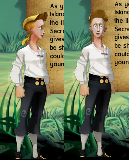
Its hard to compare different styles, but no, Tales of MI is not looking worse then SE speaking in some general graphic issues, and actually Tales of MI Guybrush is better looking then SE one, which wasnt a hard thing to do
 ,
,
and pretty good on the spot with its design. however, and without arguing on 3d aspect, graphics could certanly use some details, in therms of variety for example. i dont wanna go into financial or budget issues as i understand it, but in therms of some more simple decisions, details, choice of colours, patterns and so on. many 3d games tend to look a little straightforward in terms of colours, like its a set and stage at the theater that u watch for couple of hours with the same background props for the scenes. thats the problem i find also with similiar games, counting there also Sam & Max and Wallace and Grommit.
Of course, i m bothered with this because i think Tales of MI shure is actually not bad looking, even if now we are talking about 3d with keyboard controls, but i ll leave that aside for now.
So, where i m pointing. If we turn attention onto the water, you could really sense some little variety while looking at the scenes and screenshots, and somehow the whole scene looks bland. i tried to break the monotony with some different or agressive choice of colour, to look somehow more natural, and at the same time, more cartoonish as well.


the second scene has also redesigned water, but this time with some different patterns and couple of variations, where i just added some more waves, but still the whole scene feels a little different. Also, if we add variety for the clouds as well, i think the scene is a growing somehow, with a sense of wide area, like area where we would sail later on.


As for the third example, i simply changed the sand which is down right where Guybrush is standing, trying to make a little twist to design and colour scheme without changing too much of original design, to make it look maybe more detailed or rich.


Also, there has been much talk about which is better, SE or Tales, Tales or Escape, are Monkey 1 and 2 better drawn and so on.
Its hard to compare different styles, but no, Tales of MI is not looking worse then SE speaking in some general graphic issues, and actually Tales of MI Guybrush is better looking then SE one, which wasnt a hard thing to do
,and pretty good on the spot with its design. however, and without arguing on 3d aspect, graphics could certanly use some details, in therms of variety for example. i dont wanna go into financial or budget issues as i understand it, but in therms of some more simple decisions, details, choice of colours, patterns and so on. many 3d games tend to look a little straightforward in terms of colours, like its a set and stage at the theater that u watch for couple of hours with the same background props for the scenes. thats the problem i find also with similiar games, counting there also Sam & Max and Wallace and Grommit.
Of course, i m bothered with this because i think Tales of MI shure is actually not bad looking, even if now we are talking about 3d with keyboard controls, but i ll leave that aside for now.
So, where i m pointing. If we turn attention onto the water, you could really sense some little variety while looking at the scenes and screenshots, and somehow the whole scene looks bland. i tried to break the monotony with some different or agressive choice of colour, to look somehow more natural, and at the same time, more cartoonish as well.


the second scene has also redesigned water, but this time with some different patterns and couple of variations, where i just added some more waves, but still the whole scene feels a little different. Also, if we add variety for the clouds as well, i think the scene is a growing somehow, with a sense of wide area, like area where we would sail later on.


As for the third example, i simply changed the sand which is down right where Guybrush is standing, trying to make a little twist to design and colour scheme without changing too much of original design, to make it look maybe more detailed or rich.
Sign in to comment in this discussion.
Comments
Just an idea... but I'm sure Telltale will make it look good anyway.
I agree. Particularly with the sand. MI has never been about realism, but stylized beauty. And this is what Tales looks to be continuing.
wow, u nailed it on that one, great work
Edward brings up some interesting points, as the colour schemes do seem a little too straightforward in the game. They primarily come across as local tones, which would be a shame to rely on, as it doesn't give anything to the well-modeled sets. However, I think what you need to do, Edward, is consider the example textures you are using. They all come across as "noisy" and a little rough, unfortunately working against your argument. I appreciate your effort in trying to press the issue, but layouts in general (in cartoons and games) need to support the characters within them. I think if you'd chosen a more muted colour scheme for the waves etc. then it would work a little better.
However, some interesting ideas here!
ToMI != CMI, we shouldn't be trying to make it so, those highly defined clouds don't mesh at all with the rest of the visuals, which don't have the same outline to their visuals. This would lead to a horrible mish-mash of designs, and imply poor art direction.
Art direction/animation is something I geek over, as people have probably seen in other threads, and these are two things ToMI gets right. If it isn't broke, don't try to fix it until it is broke. And ToMI definitely isn't broke, but in the above 'fixes', it is.
Sorry.
Working off what was already done here is how I picture a night shot should look like.
Yep, that's the sort of thing I want to see in TMI!
But yeah, the game is already getting all the modification it needs. It's not a bad thing to see the fans show off what they want to see though.
Great modification. Your little tweaks really improve the lighting and atmosphere. Good work! Thing is, modified textures aside, Telltale could easily make similar changes by implementing some full-screen shader effects. Here's hoping they do something like this.
For the sake of participation, though, here's the same screenshot with photoshop's "poster edges" filter applied to everything except the sky:
I could easily whip up the same effect on various other screenshots from ToMI. The changes I made are seperate layers in Photoshop.. actually fiddling with one of Guybrush right now.
now thats nice, even with its bright colours, and has some interesting touch of a fairytale atmosphere, resembling for instance what would Jambalaya Island look like at night, altough there is Woodtick touch i sense here as well
Is that Island a Casino?
I really don't understand why ToMI can't just be ToMI, but that's just my take on things, because ToMI untampered with provides a generally more cohesive look over all and it's better aesthetically, too.
Edit: If we're trying to add new scenes to ToMI, then why not look at what makes ToMI work and try to create something in that style, instead of doing the overlay? I'd love to see what a ToMI night scene looks like, but not ToMI brute-forced into a CMI night scene.
My problem is having ToMI in one hand, CMI in the other, and then slapping them together with an almighty *SMOOSH!*, the end results are ugly.
If we see a night scene, I think it should follow what ToMI has shown us thus far, trying to stick within that style.
Edit: Just to stress, if you can do that, I'd love to see it. I just can't appreciate the night scenes thus far because of the mish-mash of opposing styles.
I think the people who have been saying it's a lighting/shading issue are right on the money. I think the buildings/set design look right out of CMI/EMI (or are at least in keeping with that sensibility), but they just look totally flat and untextured... there's no depth or interest to it.
The character designs for Guybrush and Elaine are god awful, but it's too late to fix that, so we'll let sleeping dogs lie. However, don't use 3D if you aren't going to take advantage of it. Right now, I think because of the shading/texture issues alone, this game looks like it was made in 1995, or at least made for the 9.99 bin at Walmart
especially the night setting.
Laserschwert had some nice ideas but I don't like the overall blue tone of the pictures. It reminds me of CSI New York.
Actually, I prefer the originals to most of these, with the exception of the fog effect which was pretty cool, I mostly liked the sand texture on that one though. I don't see the issue with the cartoony look, I like it. It's clean and simple.
Oh I get it, this is a joke thread, right ? HAHAHA good stuff, carry on then.
Confirmed night scenes!
the additions most of you guys made were awesome and obviously on the right track. geez it's not like these guys are professionally redesigning the gam,e they're just showing ideas on how it could look a LOT better with just a little more work. these aren't final proofs for harsh judgment.
adding that detail to the sand and water and that atmospheric fog effect does WONDERS for that otherwise stale screenshot. If that was continued on the character models too, the game would look 100x better. Quite honestly, the screenshots that we see now look awful. Yeah yeah yeah I understand "artistic license" and all that, but that's not really what we're seeing. I think we're more seeing an already out dated art style watered down as much as it can for budget and file size limitations, which is a damn shame. With today's standards, even for some of the phenomenal examples we see from other small indie games, I don't think there's any good excuse for such a simplistic fake plastic look to everything, and nothing but plain bright colors. Just my take.
Good work guys, your modifications are impressive, and hopefully the Telltale team will make some significant graphical improvements before it's out. At the very least I hope to see some post-processing effects and some atmosphere.
If they post them here they will get comments. Personally, I dont think any of them look any better, let alone a lot.
They're made up of people that made all the other Monkey Island games and big fans on the series themselves, so I trust they're pushing themselves harder on this series than they have on the previous ones they've done so far. With every series they release, they include some enhancements, so don't base Monkey Island on Wallace & Gromit. They're probably holding back on us to leave us pleasantly surprised when the game nears release.