The new Monkey Island logo is green, slightly different font. pls fix

edited June 2009 in Tales of Monkey Island
In this thread, those of us who are thankful and excited and happy make up ridiculous things to complain about.

Look.

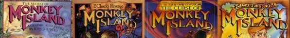
The original MI logo. The font is consistent, and the colours are manly. Purple (well, that's slightly gay), Yellow, and 2x Indy Jones fade.

original.jpg

Classics.

Now... look at this cool new logo. It's $h!+. It's not exactly the same font, and it's not purple/yellow/Indiana Jones.

new.jpg

Even though the new font harkens back to the original, and is more stylish, and the green stands out and is lush like a Tropical Island Palm Tree leaf, Tellatle sucks and I will not buy any of these games until this travesty is fixed.
«1

Comments

  • edited June 2009
    *rips hair out*

    STUPID STUPID! Han shoots first!!!
  • edited June 2009
    Nail on the head jp-30. That logo is crap.

    Now, how about Guybrush! The new model is a horror! Now this is what Guybrush looks like:

    guybrush_threepwood.gif

    Notice that sometimes he's blond, sometimes he's bearded, but never, NEVER has he been both blond and bearded! It just doesn't make sense. Is he a naive waif, or a Mighty Pirate? We can't have it both ways.
  • edited June 2009
    Sigh. ::begins building gallows::
  • edited June 2009
    I'm highly offended.
  • edited June 2009
    Are you guys kidding me? Being a hardcore fan of the original two Monkey Island games is one thing, but seriously, I absolutely love the new logo. Stop complaining and be glad that we're getting any Monkey Island at all. And if you'd rather there be none at all because you're not happy with what you've seen, regardless of the fact you haven't personally played it, no one is forcing you to buy the game.

    edit: Can I delete my post now? I just realized this a joke topic. Augh. This is what staying up for long hours does to your mind.
  • edited June 2009
    linkdragon wrote: »
    Are you guys kidding me? Being a hardcore fan of the original two Monkey Island games is one thing, but seriously, I absolutely love the new logo. Stop complaining and be glad that we're getting any Monkey Island at all. And if you're rather there be none at all because you're not happy with what you've seen, regardless of the fact you haven't personally played it, no one is forcing you to buy the game.

    Check your sarcasm-detector. I think it's broken.
  • edited June 2009
    Bagge wrote: »
    Check your sarcasm-detector. I think it's broken.
    Yeah, I'm aware of that now, thanks. ;)
  • edited June 2009
    Nail on the head jp-30. That logo is crap.

    Now, how about Guybrush! The new model is a horror! Now this is what Guybrush looks like:

    guybrush_threepwood.gif

    Notice that sometimes he's blond, sometimes he's bearded, but never, NEVER has he been both blond and bearded! It just doesn't make sense. Is he a naive waif, or a Mighty Pirate? We can't have it both ways.
    The third one looks very out of place, compared to the first two (which look more consistant) :cool:

    I don't know that all the complaints that have been voiced here are as silly as this thread wants to make them out to be, though :)
  • edited June 2009
    Jumping on the bandwagon now if I haven't completely killed this topic.

    Oh my god, I'm boycotting Telltale and every other company that starts with the letter 'T' if the poodles from the governor's mansion in SOMI aren't in this new game.
  • edited June 2009
    I don't like the design of that monkey. It looks shopped. I can tell from some of the pixels and from seeing quite a few shops in my time.
  • edited June 2009
    I hate how TTG let people complain on their forums. They should totally ban any account that says anything that isn't glowingly positive. It would make this place so much more fun and happy. Negative comments only dampen the mood and make people sad. This place should be a utopia. TTG are really slack by not takin....

    *This account has been deleted*
  • edited June 2009
    Sarcasm and mockery aside, the same logo design is on LucasArts' SoMI special edition, albeit back in that orange/yellow. Guess they figured "Its been nine years since the last game. How about a slight redesign of franchise logo?"

    MonkeyIslandSpecial.png
  • edited June 2009
    I'm not so sure about the redesign of Guybrush in that picture, though... :eek::eek:

    I like the original box a lot better -

    miorig.jpg MonkeyIslandSpecial.png
  • edited June 2009
    Redesign of the logo is cool
    Redesign of Guybrush is not so cool
    I blame expirimental drugs
  • edited June 2009
    Um why is everyone complaining? Guybrush looks better then ever, and the new logo kicks @$$, as far as I can see. Course this is coming from the guy who failed to get his copy of Monkey Island to work, so I've never played the original games. So I guess this is coming from the hardcore fans, I understand your disbelief, just like how others were mad at how they changed the original Sam & Max actors. I do know you'll adjust to everything of the new Monkey Island games, just like how some people adjusted to the new Sam & Max.
  • edited June 2009
    You really think Guybrush is looking better, though?

    504x_Guybrush_and_Elaine_Never_pay__20-Fireworks-_classsic.JPG 504x_Guybrush_and_Elaine_Fireworks_SE.JPG
  • edited June 2009
    Guybrush looks fine. Yes it's different. Everybody went through this with CMI, though. And now it's more or less accepted. Give it time.
  • edited June 2009
    It looks like Guybrush has a crudely drawn blonde seagull on top of his head, its very distracting :(
  • edited June 2009
    Guybrush looks fine. Yes it's different. Everybody went through this with CMI, though. And now it's more or less accepted. Give it time.
    I still haven't accepted it!! :eek::eek:

    But yeah... I think Guybrush is pretty damn ugly in this version. That said, I still think it looks like a great version... just not the closeups. But that's not a big issue.
  • edited June 2009
    Is this the thread where I should demand the game be released in floppies?
  • edited June 2009
    I like it. If you don't, don't buy it and keep playing the original. Or play it in classic mode if you do buy it. What does it matter?
  • edited June 2009
    I don't like quoting myself, but -
    Armakuni wrote: »
    That said, I still think it looks like a great version... just not the closeups. But that's not a big issue.

    So why would you advise me to not buy the game if I don't like the closeups? I already said it was not a big deal to me.
  • edited June 2009
    You said you haven't accepted it and that Guybrush looks pretty ugly. I didn't realize that means it wasn't a big deal. My mistake.

    [/not sarcasm]
  • edited June 2009
    You said you haven't accepted it and that Guybrush looks pretty ugly. I didn't realize that means it wasn't a big deal. My mistake.
    That said, I still think it looks like a great version... just not the closeups. But that's not a big issue.
    The bold text part means it's not a big issue ;)

    What I said was - he IS ugly, but it's not a big deal for me. It's mostly just noticable in the closeups anyway.

    The 'I still haven't accepted it' was about the change in CMI, I was just joking.
  • edited June 2009
    Armakuni wrote: »
    You really think Guybrush is looking better, though?

    I meant the Telltale version of him, the new re-mastered original version of him, sucks!
  • edited June 2009
    Oh I see! I agree the Telltale version is looking pretty nice.
  • edited June 2009
    Armakuni wrote: »
    Oh I see! I agree the Telltale version is looking pretty nice.

    Yeah, I quite like it cause he looks older and more cooler at the same time.
  • GaryGary Telltale Alumni
    edited June 2009
    Eduardo wrote: »
    Is this the thread where I should demand the game be released in floppies?

    If you ship me a wheelbarrow of floppies for each episode, I'll copy them to floppies for you!*

    If you pre-order the entire season, DavidE will even tie the wheelbarrows together with a jump-rope!

    *No, I won't actually do that for you. Sorry.
  • edited June 2009
    Actually, the Wii version (40 megs, right?) would fit on around 30 floppies :p
    That's just about twice as much as the biggest floppy game I can remember :D
  • edited June 2009
    I like the new one. Actually i never liked the gradient ones.
  • edited June 2009
    Yeah, the new logo isn't bad at all :p
  • edited June 2009
    I like it, and it's not like it's a total departure from the previous fonts. It's clearly inspired.
  • edited June 2009
    Gary wrote: »
    If you ship me a wheelbarrow of floppies for each episode, I'll copy them to floppies for you!*

    If you pre-order the entire season, DavidE will even tie the wheelbarrows together with a jump-rope!

    *No, I won't actually do that for you. Sorry.

    FOILED!

    "Please pretty please with sugar on top?”

    ;)
  • edited June 2009
    I am guessing it has to do with the theme of the game. Lechuch is usually becomming more and more demonic each game. Starts out as a zombie, and each death just makes him more powerfull. Seeing the titles of the chapters and reading what the game is about, it seems that the color might very well be related to what is going on in the game. Greenish like disease/plague something.

    I like to see him having a beard again, and also like reading that they kept true to the voodoo ladies 5 game deal.

    And the remake of the first one :) Adventure games these days has suddenly exploded. Simon the Sorcerer 4, Gobliiins 4, Monkey Island (5 sort of), Broken Sword 4 (okay a bit old now, but still helped keeping a almost dead genre alive) and some completely new ones like Ceville. Even a remake of Broken Sword 1 for Wii :)

    Quality of games still seemed better back in those days. For some reason 2d just seemed to fit better and they could focus more on music and sound effects and other nice details. I guess I just have gotten addicted to pixelation of everything, and having to imagine what it really was, whenever the mouseover didnt have any explanation.
  • edited June 2009
    Simon the Sorcerer 5, actually. The English version should be released some time this year.
  • edited June 2009
    Ah, sarcasm, the confusion you cause.

    I know it's meant to point out the silliness of nitpicking a game we'd have killed to see made, but it also illustrates how we could be arguing about things far less fundamental to the game than the controls used to play it. :)
  • edited June 2009
    Yeah, controls are incredibly important gameplay-wise, I don't think it's silly to complain about that. I guess what some people are getting at is the way some people complain about it, not the fact that they are complaining. At least I hope so.
  • edited June 2009
    Eduardo wrote: »
    Simon the Sorcerer 5, actually. The English version should be released some time this year.

    Did you actually try playing Simon 4?

    It was utterly awful, you could tell that the new developers had completely no understanding of the characters, and no idea about why the original games were so good.

    It would be as if someone who had never heard of Monty Python was given a couple of pictures from the show, and then asked to write a new series.
  • edited June 2009
    ... but it also illustrates how we could be arguing about things far less fundamental to the game than the controls used to play it. :)

    Point.
  • edited June 2009
    l cannot understand the Special remake team choosin the final Guybrush design since as other people have mentioned, the hair is very distactin, whereas it makes his forehead looks big.

    I can live with it though since the good thing with mi games is that the guybrush''s design changes in each game. I am happy that TT did their own ver and not usin the se design
Sign in to comment in this discussion.